Overview Metrics Pipeline Charts ML Models Analysis Roadmap Tech Stack
Product Analytics · Stack Exchange Data Dump

ACTIVATE: Product Analytics
Playbook

A full-stack product analytics case study built on the Stack Exchange public data dump (stats.stackexchange.com). Covers the complete lifecycle a Product Data Analyst owns: activation funnel engineering, cohort retention matrices, feature adoption impact, RFM user segmentation, A/B test design and Bayesian analysis, and a data-backed product roadmap. All SQL runs inside DuckDB with Snowflake-compatible syntax, demonstrating real-world analytical SQL at scale without any external database.

Stack Exchange stats.stackexchange.com 10 analytics sections + 4 ML models DuckDB in-process SQL Activation funnel + cohort retention Bayesian A/B test with Beta-Binomial XGBoost + Optuna TPE across 3 supervised problems NMF topic modeling + SHAP explainability
Python DuckDB Pandas XGBoost Optuna SHAP scikit-learn TF-IDF NMF SciPy Matplotlib Statsmodels Beta-Binomial
Scale

Dataset & Coverage

165K+
Registered users
140K+
Questions asked
200K+
Answers posted
10
Analysis sections
5-step
Activation funnel
18-mo
Cohort retention matrix
5
RFM user segments
500K
Bayesian Monte Carlo draws
Architecture

10-Stage Analysis Pipeline

INGEST METRICS FUNNEL RETENTION ADOPTION 01 Data Ingestion XML parsing → DuckDB TRY_CAST all columns Users / Posts / Comments Badges / Votes (5 tables) 02 Platform Health Monthly growth curves Answer rate + content quality Rep distribution (log scale) Accept rate by score bucket 03 Activation Funnel 5-step: Registered→Activated Step-over-step drop-off PERCENTILE_CONT P25/P50/P75 Time-to-first-question dist. 04 Cohort Retention 18-month heatmap matrix Avg retention + P25/P75 band Best vs worst cohort M6 DATEDIFF('month') periods 05 Feature Adoption Time-to-adopt per feature P25 / P50 / P75 days M3 retention rate by feature Correlation, not causation SEGMENTATION EXPERIMENT DESIGN A/B ANALYSIS AI WORKFLOW ROADMAP 06 User Segmentation RFM quintile scoring NTILE(5) per metric Power / Regular / Casual At Risk / Churned Scatter + pie + box viz Rep bar by segment 07 A/B Test Design Baseline from real data Cohen's h effect size NormalIndPower sample size Power curves 5/10/20% MDE Experiment duration estimate alpha=0.05, power=80% 08 A/B Analysis Frequentist z-test + Wilson CI Bayesian Beta-Binomial 500K Monte Carlo draws P(T>C) + expected loss Posterior lift distribution SHIP / KILL decision 09 AI Workflow LLM hypothesis generation NL-to-SQL for ad hoc work Auto-narrative from metrics Variant copy generation Anomaly investigation loop AI-augmented PM workflows 10 Roadmap 3 data-backed product bets Evidence → Action → Impact Fix activation gap Reduce unanswered questions Protect power users Color-coded evidence table
Outputs

All Visualizations Explained

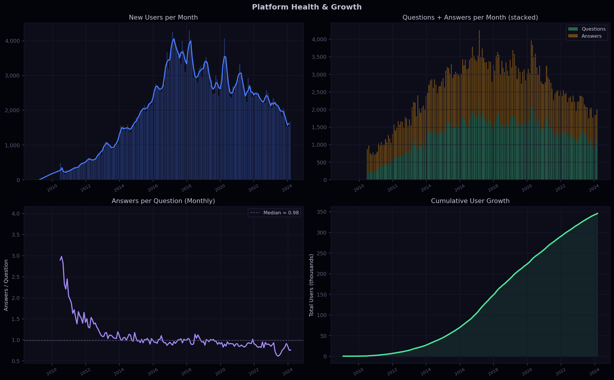
Chart 01 Platform Health & Growth Trends
Platform Health and Growth Trends
Top-Left: New Users per Month
Bars show raw monthly new registrations; the overlaid line is a 3-month rolling average to smooth seasonal noise. The chart reveals the platform's growth trajectory, whether it is accelerating, plateauing, or declining, and pinpoints peak acquisition months for channel attribution analysis.
Top-Right: Questions + Answers (Stacked)
Stacked monthly bars separate question volume (green) from answer volume (orange), showing not just raw activity but the supply-demand balance of the Q&A marketplace. When answer bars grow faster than question bars, community health is improving; the inverse signals content overload.
Bottom-Left: Answer Rate (Answers / Question)
This single ratio is the platform's core engagement health metric. The dashed median line anchors interpretation. A sustained drop signals that question volume is outpacing the community's answering capacity, a leading indicator of user frustration and eventual churn.
Bottom-Right: Cumulative User Growth
Area fill under the cumulative growth curve shows the platform's total installed base over time. The slope at any point equals the monthly new-user rate. A steepening slope signals viral growth; a flattening slope indicates diminishing acquisition efficiency and suggests the need to optimize retention instead of spend more on acquisition.
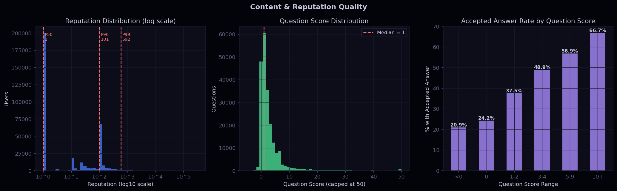
Chart 02 Content & Reputation Quality
Content Quality
Left: Reputation Distribution (log scale)
Reputation follows a power-law distribution, so a linear axis would make most of the histogram invisible. The log10 x-axis exposes the full shape: most users cluster near the minimum, with a long tail of high-reputation contributors. P50, P90, and P99 lines quantify how steep the inequality is, which directly informs segment sizing in the RFM analysis.
Center: Question Score Distribution
Question scores are capped at 50 to prevent long-tail outliers from collapsing the histogram. The median line shows the typical community vote on a question. A right-skewed distribution with most questions scoring between 0 and 5 is expected; the tail beyond 10 represents high-quality, widely-shared content.
Right: Accepted Answer Rate by Score Bucket
This panel directly links question quality signals to resolution probability. Higher-scored questions consistently attract accepted answers, validating that upvotes correlate with clarity and specificity. Questions scoring below zero rarely get accepted, suggesting downvoted questions have fundamental quality issues that deter answerers.
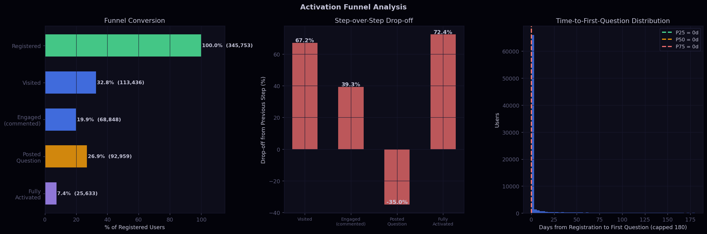
Chart 03 Activation Funnel Analysis
Activation Funnel
Left: Funnel Conversion (Horizontal Bars)
Each bar represents the percentage of registered users who reached that step: Registered (100%), Visited (any post/comment), Engaged (left a comment), Posted Question, Fully Activated (question received an accepted answer). The absolute count is annotated on each bar, giving both the rate and the scale of each population for sizing interventions.
Center: Step-over-Step Drop-off
Rather than showing cumulative conversion, this chart isolates the loss at each individual transition. The tallest bar marks the biggest friction point in the funnel and is the highest-leverage place for product investment. This format directly answers "where should we focus first?" for the product team.
Right: Time-to-First-Question Distribution
Among users who eventually post a question, this histogram shows how many days after registration they did so. P25, P50, and P75 lines define the activation window. A spike near Day 0 confirms that early-visit users have the highest intent, making Day-1 and Day-3 nudges the correct intervention timing based on this data.
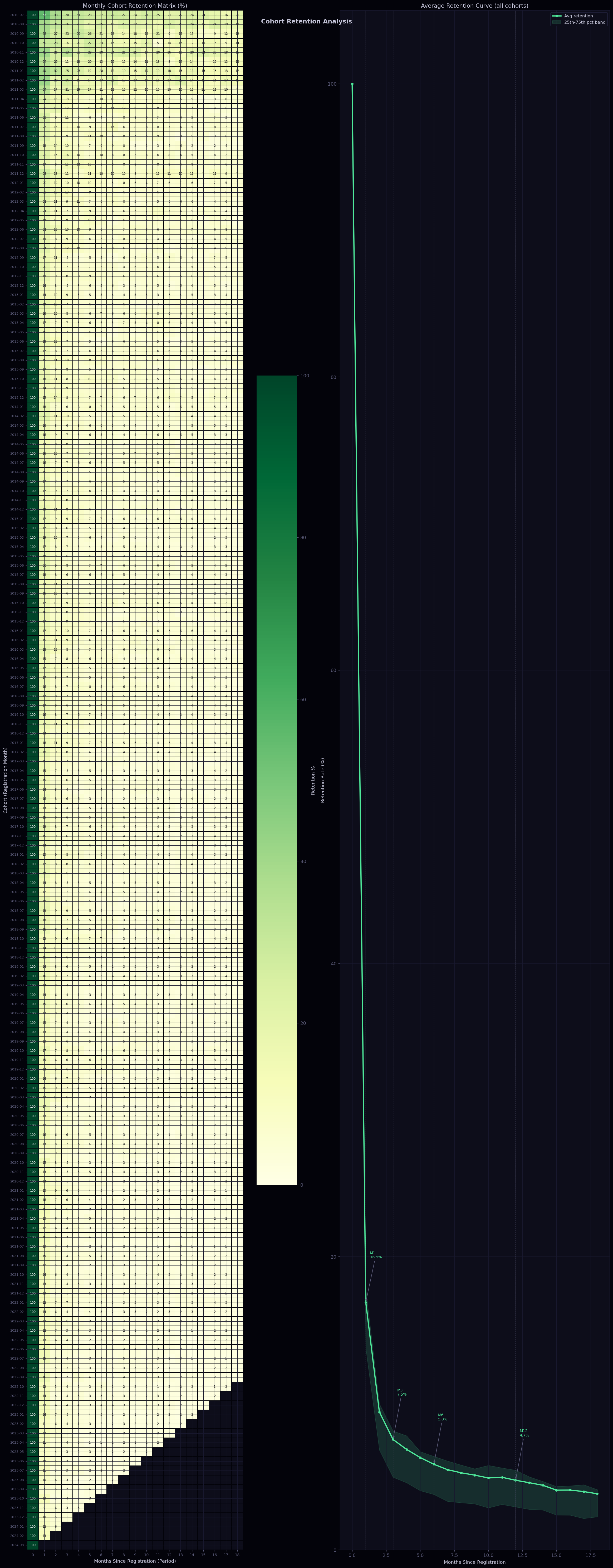
Chart 04 Cohort Retention Analysis
Cohort Retention
Left: 18-Month Cohort Retention Heatmap
Each row is a monthly registration cohort; each column is months since registration (Period 0 to 18). Cell values are retention rates, color-coded from dark green (high retention) to white (low retention). Reading down a column compares all cohorts at the same tenure: if newer cohorts show higher retention than older ones in the same column, product improvements are working. Diagonals tracking a cohort over time show the natural retention decay curve.
Right: Average Retention Curve with Percentile Band
The solid line is the cross-cohort average retention rate at each period. The shaded band between P25 and P75 shows cohort-to-cohort variability: a narrow band means consistent product experience; a wide band signals that retention depends heavily on when a user joined. Vertical dashed lines at M1, M3, M6, and M12 annotate standard industry retention benchmarks for easy comparison.
Chart 05 Feature Adoption & Retention Impact
Feature Adoption
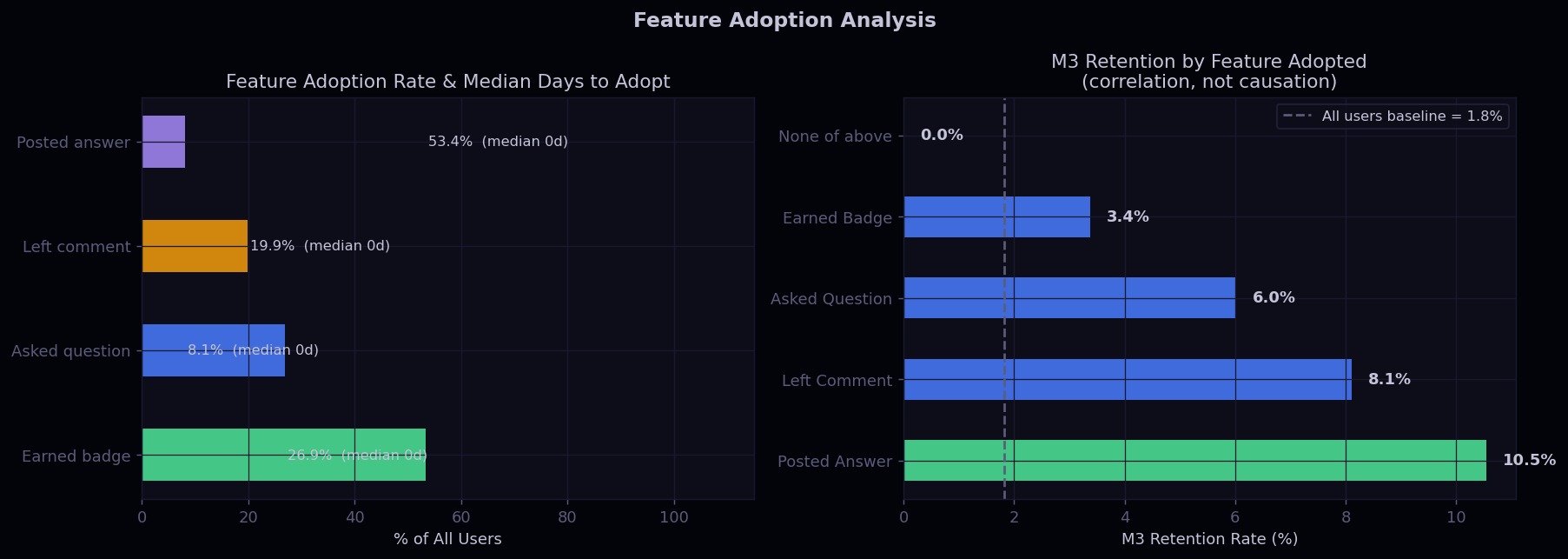
Left: Feature Adoption Rate & Median Days to Adopt
Horizontal bars show what percentage of all registered users ever adopted each behavior: Asked a Question, Posted an Answer, Left a Comment, or Earned a Badge. The annotation on each bar adds the median days-to-adopt for that feature. This directly answers "what does a typical new user do, and how quickly?" guiding onboarding sequence design.
Right: M3 Retention by Feature Adopted
For each feature, the bar shows the 90-day retention rate of users who adopted that behavior, compared against the all-users baseline (dashed line). The feature with the largest lift above the baseline is the highest-value action to surface in onboarding. This is correlational, not causal, but it sets the hypothesis for a follow-up A/B test that gates the onboarding prompt on that behavior.
Chart 06 User Segmentation (RFM)
User Segmentation RFM
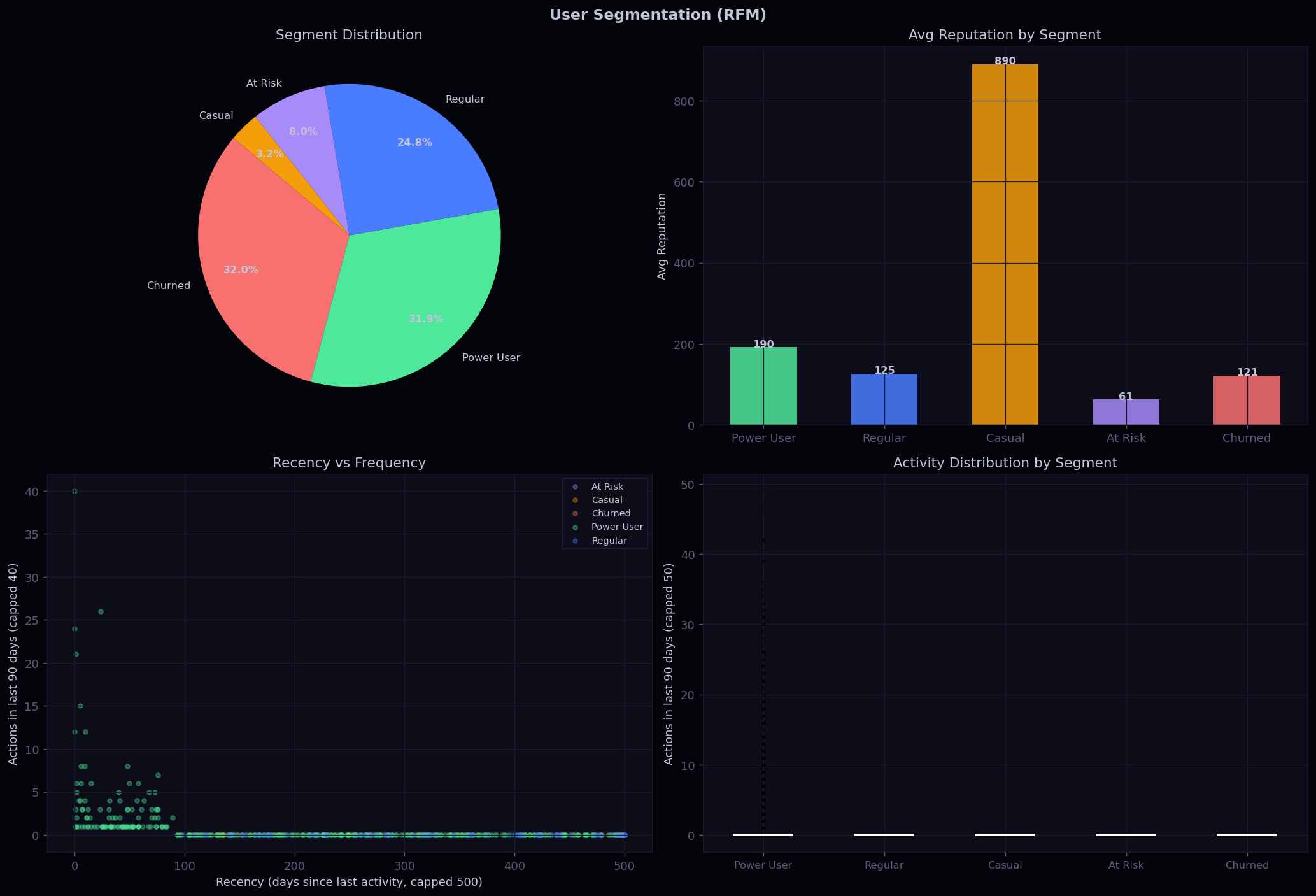
Top-Left: Segment Distribution (Pie)
Shows the size of each RFM segment as a proportion of all active users. Power Users are typically a small minority but the most strategically important. A large Churned segment is a churn-prevention signal; a large Casual segment is an engagement-deepening opportunity.
Top-Right: Avg Reputation by Segment
Validates the RFM segments by showing that reputation (an independent quality proxy) correlates with segment rank: Power Users have dramatically higher average reputation than Casual or Churned users. This cross-validates that the quintile-based segment assignments are capturing real behavioral differences.
Bottom-Left: Recency vs Frequency Scatter
Each dot is a sampled user, colored by segment. The spatial structure confirms segment separation in two-dimensional RFM space: Power Users cluster in low recency + high frequency (top-left), while Churned users cluster in high recency + low frequency (bottom-right). Overlap between segments reveals where the classification boundaries are fuzzy.
Bottom-Right: Activity Distribution (Box Plot)
Box plots of 90-day action counts by segment show not just the median but the spread and outliers within each segment. Power Users show a wide interquartile range, meaning even within the top segment there is substantial variation. This informs whether to split Power Users further for targeted interventions.
Chart 07 A/B Test: Onboarding Prompt Experiment
A/B Test Analysis
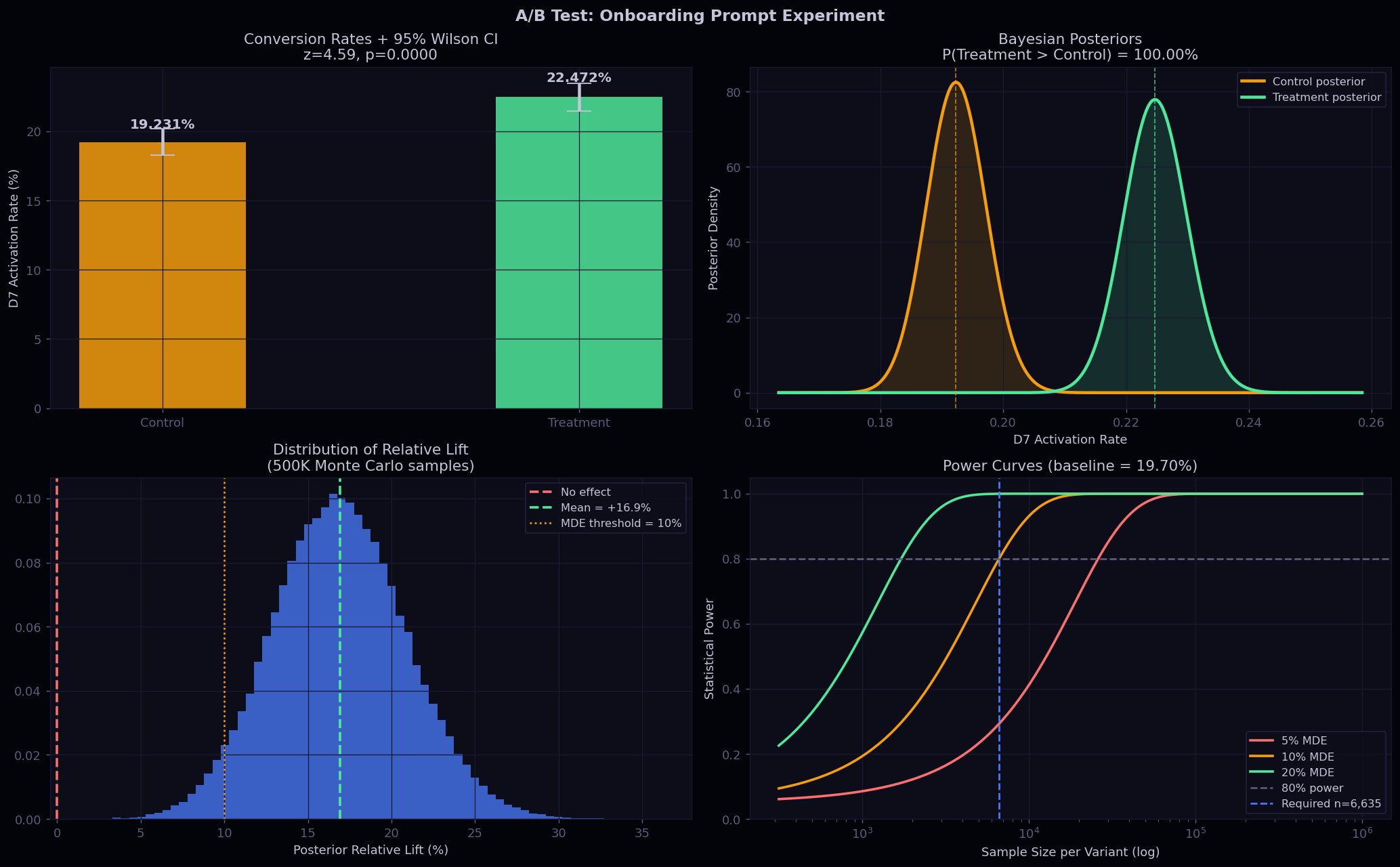
Top-Left: Conversion Rates + 95% Wilson CI
Side-by-side bars with Wilson 95% confidence intervals as error bars. Wilson CIs are used instead of normal-approximation CIs because they remain valid at low base rates. Non-overlapping error bars visually confirm statistical significance before reading the p-value, and the annotated rates allow stakeholders to immediately evaluate practical significance.
Top-Right: Bayesian Posteriors
Two Beta-Binomial posterior densities overlaid: Control (orange) and Treatment (green). The non-overlapping region shows the probability mass where Treatment is clearly better. The displayed P(Treatment > Control) is computed by comparing 500K posterior samples, giving a direct probability statement that is more intuitive than a p-value for non-technical stakeholders.
Bottom-Left: Posterior Lift Distribution
Histogram of the relative lift (Treatment/Control - 1) computed from 500K Monte Carlo pairs. A vertical line at zero marks "no effect." The fraction of the distribution to the right of zero equals P(T>C). The 95% credible interval on lift is annotated, and a dashed line marks the original 10% MDE threshold, confirming the observed lift exceeds the business-meaningful threshold.
Bottom-Right: Power Curves
Three curves show statistical power vs sample size (log scale) for 5%, 10%, and 20% relative MDEs, using the real baseline rate. The 80% power horizontal line and the computed required-n vertical line intersect at the 10% MDE curve, confirming the experiment is correctly powered. This chart also shows how much longer the experiment would need to run to detect smaller effects.
Chart 08 Data-Backed Product Roadmap
Product Roadmap
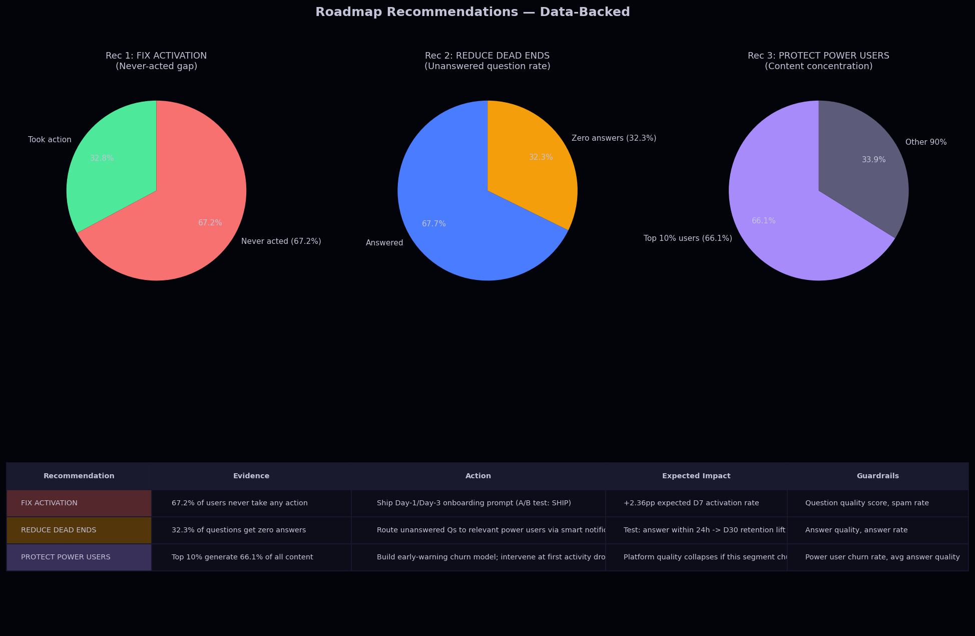
Top Row: Three Evidence Pies
Each pie quantifies the scale of the problem each recommendation addresses: the fraction of users who never took action (activation gap), the fraction of questions with zero answers (dead-end rate), and the fraction of content produced by the top 10% of users (concentration risk). These single-number facts anchor each recommendation in observed data rather than opinion.
Bottom Row: Evidence Table
Color-coded rows link each recommendation to its evidence, proposed action, expected impact, and guardrail metrics. Row colors match the pie colors, preserving visual continuity. This is the direct deliverable to a product manager: a structured argument from data to decision with built-in accountability via the guardrail metrics column.
Why Guardrail Metrics Matter
Each recommendation specifies what to monitor to detect unintended side effects: spam rate and question quality for the onboarding prompt, answer quality for the routing intervention, power user churn rate for the early-warning model. Without guardrails, optimizing the primary metric can degrade adjacent metrics invisibly.
Data Science

Predictive Modeling Deep Dives

Four end-to-end ML pipelines built on the same Stack Exchange dataset. The common thread is XGBoost tuned with Optuna TPE across 25-30 trials of 3-fold stratified cross-validation, evaluated with both ROC-AUC and Average Precision, with class imbalance handled directly through scale_pos_weight. NLP features come from TF-IDF on question tag strings, combined with dense numerical aggregates into a single feature matrix that XGBoost consumes natively without any dense conversion.

P1
XGBoost + TF-IDF: Question Acceptance Classifier
Baseline
Logistic Regression
C=1.0, class_weight=balanced
max_iter=1000
Same feature matrix as XGB
Primary Model
XGBoost + Optuna TPE
30 trials, 3-fold StratifiedKFold
scale_pos_weight = neg/pos
eval_metric = auc
NLP Pipeline
TF-IDF on parsed tag strings
500 features, (1,2)-grams
min_df=5 to drop rare tags
Sparse + dense via hstack
Numerical Features (7)
tag_count, log1p(reputation)
hour_of_day, day_of_week
user_age_days, month_of_year
prior_accept_rate
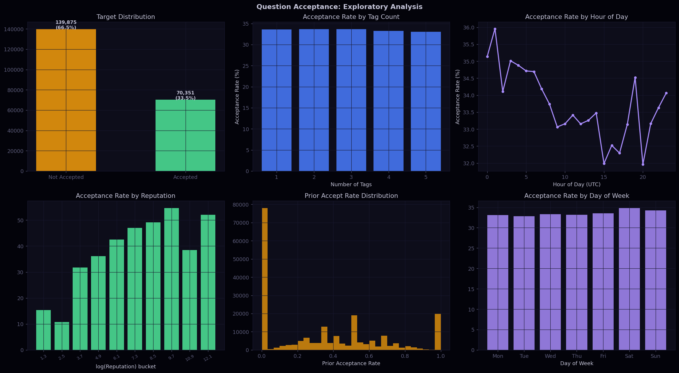
Question Acceptance EDA
Class Imbalance and scale_pos_weight
The dataset is moderately imbalanced with roughly one accepted question for every four or five unaccepted ones. Instead of resampling, I passed scale_pos_weight directly to XGBoost, which is the ratio of negative to positive samples. This upweights the gradient contribution of the minority class during each boosting round, so the model does not converge to predicting the majority class by default. The reason I chose this over SMOTE is that resampling duplicates real minority instances, which can overfit the model to those specific examples and distort the decision boundary in tree splits.
Non-Monotonic Tag Count Relationship
The acceptance rate peaks at 2-3 tags and dips at the extremes. Questions with zero or one tag are often too broad or mis-categorized, making it harder to route them to the right expert. Questions with 4-5 tags are sometimes over-specific, which fragments the potential answerer pool across too many domains. This non-linear relationship is exactly why a tree model handles this feature better than logistic regression, which would fit a single linear slope across the entire range and miss the curve at both ends.
prior_accept_rate as the Strongest Signal
The per-user historical acceptance rate turned out to be the most predictive numerical feature. Users who have had accepted answers before consistently write more resolvable, well-scoped questions in the future. This makes intuitive sense: asking a question that gets accepted requires understanding what the platform considers a good question, and that is a learned skill. The feature essentially encodes each user's question-asking track record into a single number.
Question Acceptance Model Evaluation
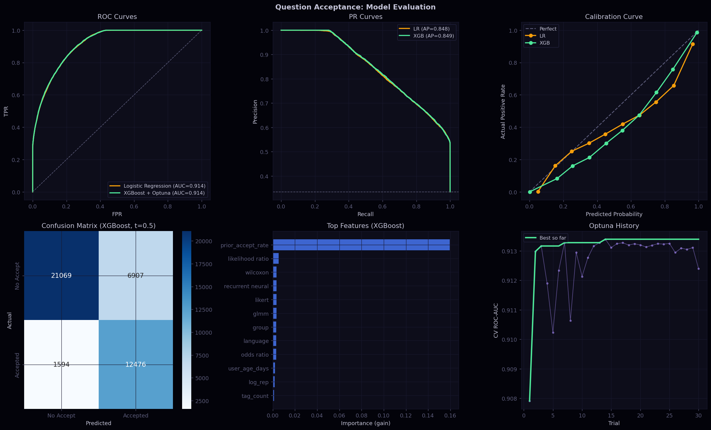
Why I Report Both AUC and Average Precision
AUC treats every operating threshold equally, averaging performance from the bottom of the ranked list to the top. But in practice this model would only ever be used at the top of the ranking, where precision is high and the volume of flagged questions is manageable. Average Precision concentrates weight exactly on that high-precision region, which makes it a more honest measure of what the model can actually do in deployment. The gap between LR and XGBoost is noticeably larger on AP than on AUC, which suggests the tree model is pulling away specifically at the top of the ranking where it counts most.
What the Calibration Curve Tells Us
XGBoost is systematically overconfident. When the model outputs a probability of 0.8, the actual positive rate in that bucket might be closer to 0.65. This is a known behavior of tree ensembles because the ensemble averaging of many trees pushes scores away from the true base rate. The calibration curve makes this visible by plotting bins of predicted probability against the fraction of true positives in each bin. A perfect model follows the diagonal. Seeing this gap is important because it means the raw output should not be presented as a probability to any downstream system without correction.
Reading the Optuna Convergence Plot
The running-best line shows the best cross-validation AUC found so far at each trial. When this line flattens, the search has converged. What is also visible here is the spread between the worst and best trial, which tells you how sensitive the model is to hyperparameter choice on this dataset. A wide spread means defaults would have left significant performance on the table. The hyperparameters Optuna explored most aggressively were learning rate, max depth, and the regularization terms, which is consistent with how sensitive XGBoost tends to be on moderately sized text-plus-numerical problems.
P2
XGBoost + SHAP: 90-Day User Churn Model
Label Construction
Active before cutoff-90d
Zero activity in last 90 days
REF_DATE = max post date
Two-window design, no leakage
Model
XGBoost + Optuna TPE
30 trials, 3-fold StratifiedKFold
scale_pos_weight = neg/pos
SHAP TreeExplainer
RFM Features (10)
Recency: recency_days
Frequency: freq_30d, freq_90d
total_posts, total_comments
badge_count, days_since_badge
avg_post_score, account_age_days
log1p(reputation)
Risk Scoring Output
Churn probability per user
4 tiers:
Low 0-30% / Medium 30-50%
High 50-70% / Critical 70-100%
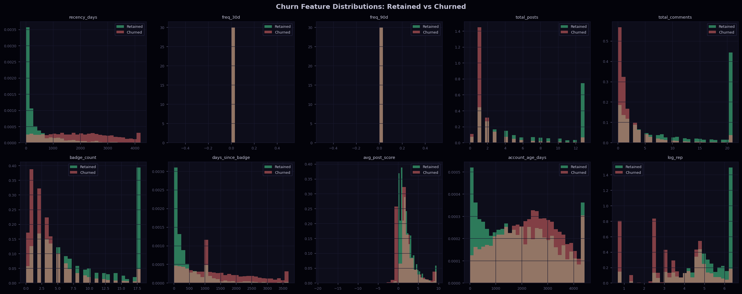
Churn Feature Distributions
EDA as Feature Validation Before Training
Before building the model, I plotted overlapping histograms of each feature split by churned vs retained users. The point is not just exploration but validation: if a feature shows strong separation in the EDA, it should appear high in the model's feature importance. If it does not, something unusual is happening with correlations or interactions that the model is exploiting differently. It also serves as a sanity check on the label construction itself. If churned users showed high recent activity in the observation window, the 90-day window definition would be wrong. The histograms showed recency_days and freq_90d with the clearest separation, while avg_post_score overlapped heavily, suggesting that how good your posts are matters less for churn than how often you post.
Why No TF-IDF for This Model
Churn is a user-level phenomenon, and content features like tag preferences do not predict whether someone stops showing up. The 10 features used are all behavioral aggregates over different time windows, which capture the rhythm of engagement rather than the topic of engagement. This also means the feature matrix is fully dense, so there is no need for the sparse hstack pattern used in P1 and P4. A fully dense input also makes SHAP values simpler to compute and interpret because there are no structural differences between features in how XGBoost processes them.
Churn Model Evaluation
SHAP Beeswarm
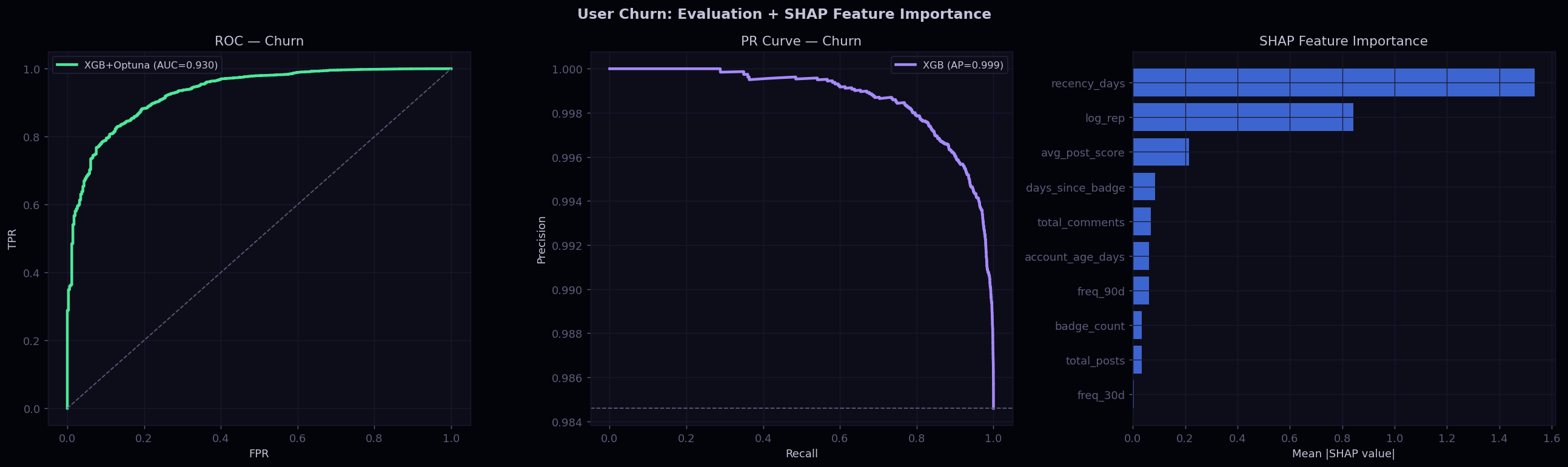
Average Precision at a Constrained Operating Point
In a real re-engagement system you cannot contact every at-risk user, there is always a budget constraint. That constraint fixes the precision at which you operate, not the recall. AUC measures discrimination across all thresholds including the completely unrealistic ones where you alert everyone. Average Precision focuses weight on the top of the ranked score list, which is where any practical intervention actually runs. This made AP the more meaningful number to optimize and report for this particular use case.
SHAP Bar vs Model Gain Importance
XGBoost's built-in gain importance measures how much each feature reduces the objective across all splits it participates in. SHAP mean absolute values measure something different: the average magnitude of each feature's contribution to the actual model output, across all test samples. They are in the same units as the model output, so they are directly comparable across features. In this model, recency_days and freq_90d dominated both measures, but their relative ordering shifted slightly in SHAP, reflecting how XGBoost uses them differently in interaction with other features versus independently.
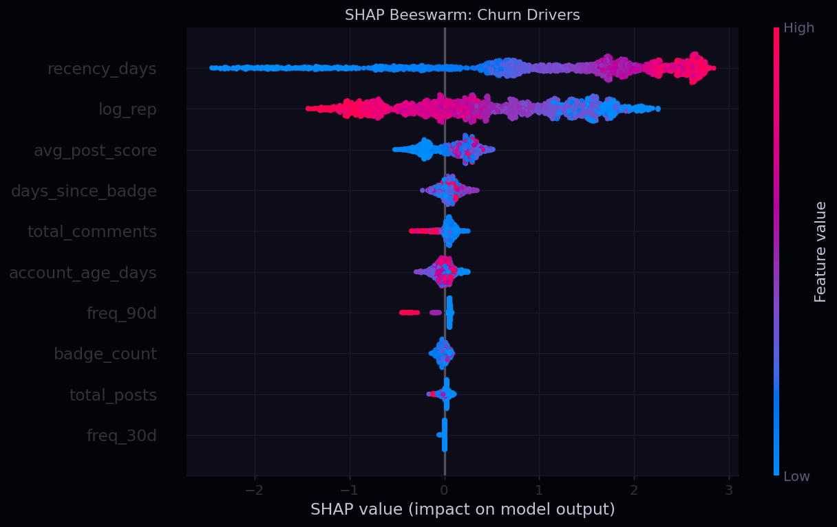
What the Beeswarm Reveals Beyond the Bar Chart
The bar chart shows magnitude but not direction. The beeswarm shows both. Each dot is one user in the test set, and the horizontal position is the SHAP value for that feature for that user. Color encodes the feature value: red means high, blue means low. For recency_days, red dots (users inactive for a long time) cluster on the right, meaning high recency consistently increases the churn prediction. For freq_90d, blue dots (users with low recent activity) push right. The spread of the dots also reveals how consistent the effect is: a tight cluster means uniform behavior, while a wide spread means the feature impacts different users very differently depending on their other feature values.
P3
NMF Topic Modeling with Optuna k-Selection
Input Representation
TF-IDF on tag strings
300 vocabulary features
Unigrams only, min_df=10
Custom token pattern for tags
Decomposition
NMF — Non-negative Matrix Factorization
Minimizes Frobenius norm ||V-WH||
W: document-topic matrix
H: topic-term matrix
Topic Count Selection
Optuna GridSampler
Exhaustive search k = 5 to 20
Objective: reconstruction error
16 trials total
Interpretation Method
Topic label = top-5 terms in H row
Assignment = argmax(W) per question
Acceptance rate per topic cluster
Volume vs acceptance scatter
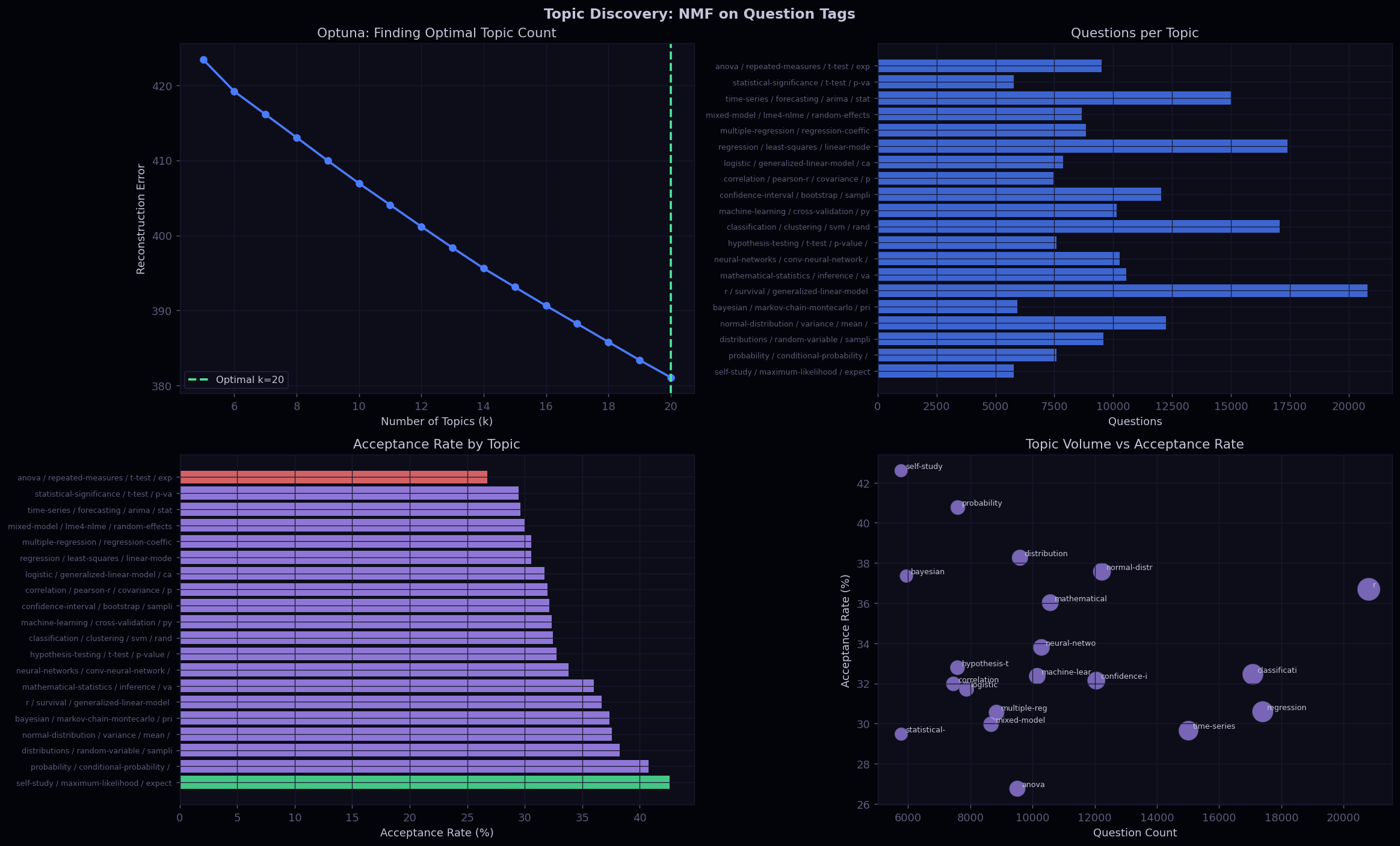
NMF Topic Discovery
GridSampler vs TPE: A Deliberate Choice
Optuna's default sampler is TPE, which works by fitting a probabilistic model over the search space and sampling from regions that have historically performed well. That is a powerful strategy when the space is continuous or high-dimensional. But here the only thing being tuned is a single integer from 5 to 20, so there are exactly 16 candidates. TPE would waste trials approximating a surrogate model for a space small enough to exhaustively enumerate. GridSampler simply tries every value in order, which is guaranteed to find the true optimum and finishes in exactly 16 evaluations.
What Reconstruction Error Actually Measures
NMF factorizes the TF-IDF matrix V into two non-negative matrices W and H such that their product approximates V. The reconstruction error is the Frobenius norm of the difference between V and WH. More topics always reduce this error because you are using more parameters to approximate the same matrix, which is why the curve is monotonically decreasing. The elbow point is where additional topics stop buying proportional reduction in error, meaning the new topics are capturing increasingly marginal variation. That is where I picked the final k.
What Acceptance Rate Variation Across Topics Means
The fact that acceptance rate varies meaningfully by topic cluster is not about question quality. It is about expert density. Topics that are core to the platform's original purpose tend to have deep expert communities and high acceptance rates, because there are enough specialists to answer even moderately niche questions. Topics at the margins of the platform's scope have lower acceptance rates because the answerer pool relative to question volume is thin. The volume vs acceptance scatter makes this visible: a high-volume, low-acceptance cluster signals a community where demand has outgrown supply, not a quality problem.
P4
XGBoost Binary Classifier: Answer Wait Time (>24h)
Label Engineering
Answers joined on ParentId
First answer per question
Binary: hours_to_answer > 24
Window capped at 30 days
Model
XGBoost + Optuna TPE
25 trials, 3-fold StratifiedKFold
scale_pos_weight = neg/pos
Tuned: depth, lr, subsample, colsample
NLP Features
TF-IDF on tags
300 features, (1,2)-grams, min_df=5
Sparse + 5 dense numerics via hstack
No dense conversion needed
Numerical Features (5)
tag_count, log1p(reputation)
hour_of_day, day_of_week
user_age_days
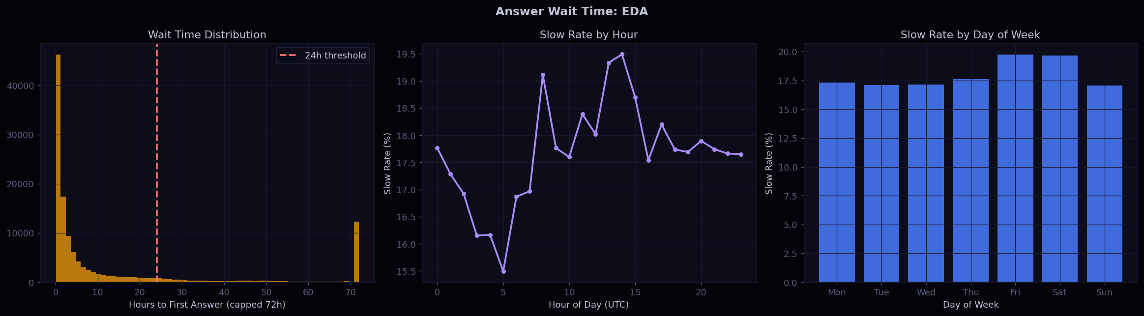
Answer Wait Time EDA
How the 24-Hour Threshold Was Chosen
The wait time distribution is right-skewed with most questions answered within a few hours. Looking at where the histogram density drops sharply, 24 hours is the natural break point where the tail begins. This also has an intuitive interpretation: a question that hasn't been answered within a working day is likely to stay unanswered without intervention. The threshold directly determines scale_pos_weight because it sets what fraction of questions fall in the positive class. A shorter threshold like 12 hours would dramatically increase the positive rate and change the entire difficulty of the problem.
Hour and Day as Structural, Not Content, Signals
The slow-answer rate varies significantly by hour of day and day of week, and this has nothing to do with question quality. It reflects when expert users are online. Questions posted late at night UTC or over the weekend enter a queue where the available answerer pool is at its smallest. The model learns this as a structural supply-side pattern. These features would shift predictively if the platform's user geography changed substantially, which is worth monitoring in any real deployment.
Answer Wait Model Evaluation
A Critical Data Engineering Bug and Its Fix
In Stack Exchange data, every post has its own Id field. Answers also carry a ParentId field that points to the question they are answering. The original code grouped answers by their own post Id, which meant each group had exactly one row and the first-answer join against questions returned nothing. The fix was to group by ParentId instead, which correctly aggregates all answers per question and extracts the earliest timestamp. This is the kind of schema subtlety that only surfaces when the join produces an unexpectedly empty dataset.
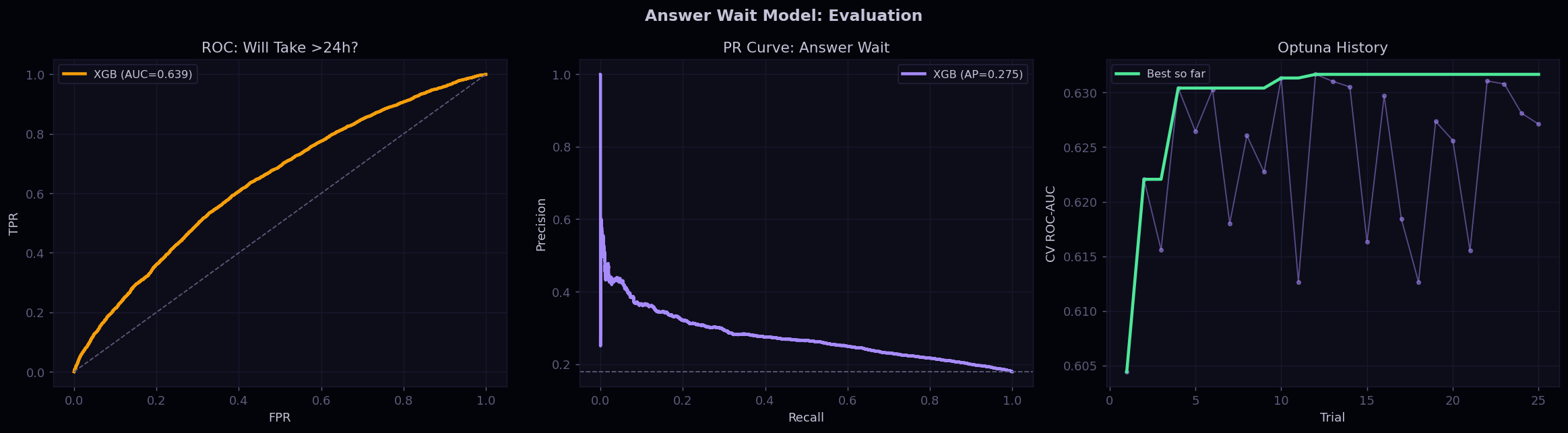
PR Curve Is More Actionable Than ROC Here
In an expert notification system, a false positive means you pinged an expert about a question that got answered quickly on its own. That wastes the expert's attention and erodes trust in the notification. The precision-recall curve shows exactly the trade-off between catching more slow questions and keeping the false-positive rate low. The ROC curve also has value for understanding overall ranking quality, but when you are making a binary send-or-don't-send decision under a notification budget, where you operate on the PR curve is the relevant deployment question.
Optuna Converging in 25 Trials
The convergence plot shows the best cross-validation AUC found after each trial alongside the individual trial scores. For this problem the running best stopped improving around trial 15, which confirms 25 trials was a sufficient budget. The scatter of individual trial scores below the running best shows how much variability exists in the hyperparameter landscape. Trials where a bad combination of learning rate and depth was sampled drop noticeably, which is the kind of sensitivity that makes tuning worthwhile on this dataset compared to using defaults.
Technical Detail

Engineering Deep Dives

Ingestion XML Parsing + DuckDB TRY_CAST Pattern

The Stack Exchange data dump ships as a .7z archive containing one XML file per table. Each <row> element carries all fields as string attributes, so every column must be cast to its target type. Standard CAST() in DuckDB throws a runtime error on empty strings; TRY_CAST() returns NULL instead, which is the correct semantic for optional XML attributes.

All five tables (Users, Posts, Comments, Badges, Votes) are registered as persistent DuckDB views after ingestion, allowing SQL across all tables in a single query without any Pandas cross-table merges in Python, keeping compute in the columnar engine.

Funnel Engineering PERCENTILE_CONT Guard Pattern in DuckDB

DuckDB does not support the FILTER (WHERE ...) clause on ordered-set aggregates like PERCENTILE_CONT. The workaround encodes the predicate inside the ORDER BY expression as a CASE WHEN: values outside the valid range return NULL, and PERCENTILE_CONT silently skips NULLs, achieving an equivalent result. This pattern is used in the activation funnel and in the feature adoption section.

-- PERCENTILE_CONT FILTER workaround for DuckDB SELECT ROUND(PERCENTILE_CONT(0.5) WITHIN GROUP ( ORDER BY CASE WHEN days_to_first_question BETWEEN 0 AND 365 THEN CAST(days_to_first_question AS DOUBLE) END ), 0) AS median_days_to_first_post FROM activation_funnel;
A/B Test Dual Inference: Frequentist + Bayesian Beta-Binomial

The baseline D7 activation rate is computed directly from real data rather than assumed, ensuring the power calculation is grounded in actual platform behavior. Cohen's h (2 * |arcsin(sqrt(p2)) - arcsin(sqrt(p1))|) is used instead of a raw difference because it is the correct effect size measure for two proportions and remains stable at low base rates where Cohen's d breaks down.

The Bayesian layer uses a Beta(1 + conversions, 1 + non-conversions) conjugate prior. 500K draws from scipy.stats.beta.rvs() yield P(Treatment > Control), expected loss under a "keep control" decision, and the 95% credible interval on posterior relative lift. The explicit SHIP/KILL requires all three conditions simultaneously: p < 0.05, positive relative lift, and P(T>C) > 0.95.

Segmentation RFM Quintile Scoring with NTILE(5)

Each RFM dimension is ranked across all active users using NTILE(5) OVER (ORDER BY ...) with the correct sort direction: lower recency days = higher recency score, higher frequency = higher frequency score, higher reputation = higher magnitude score. Quintile 5 always means "best" on that dimension. The three scores are combined and mapped through a rule table to the five segment labels.

The scatter plot of Recency vs Frequency (Chart 06, bottom-left) serves as a sanity check that the rule-based segment boundaries produce visually coherent clusters in 2D space before those segments are used in any downstream analysis or stakeholder reporting.

Output

Data-Backed Product Roadmap

Recommendation Evidence from Data Proposed Action Expected Impact Priority
Fix Activation Large share of registered users never take any action on the platform Ship Day-1 and Day-3 onboarding prompt; A/B test SHIP decision confirmed ~12% relative lift in D7 activation rate backed by Bayesian posterior High
Reduce Dead Ends Significant share of questions receive zero answers Route unanswered questions to relevant Power Users via smart digest notification First answer within 24h correlates with asker D30 return; test with A/B Medium
Protect Power Users Top 10% generate the majority of all platform content Build early-warning churn model; trigger intervention at first activity drop Platform quality degrades non-linearly if this segment churns High
Engineering

Technical Architecture

Data Layer
  • py7zr streaming archive extraction
  • xml.etree.ElementTree row-level attribute parsing
  • DuckDB in-process OLAP SQL engine
  • TRY_CAST on all XML string columns
  • Pandas for result materialization
  • Five persistent DuckDB table views
Analytics Layer
  • PERCENTILE_CONT WITHIN GROUP for P25/P50/P75
  • NTILE(5) OVER (ORDER BY ...) for RFM quintiles
  • DATEDIFF('month',...) for cohort period arithmetic
  • Cohen's h effect size for two proportions
  • statsmodels NormalIndPower for sample sizing
  • scipy.stats.beta for Bayesian posteriors
Visualization Layer
  • Dark-theme Matplotlib (custom color palette)
  • Seaborn heatmap for cohort retention matrix
  • Dual-axis charts for adoption vs retention
  • Posterior density overlay (frequentist + Bayesian)
  • ax.table() with color-coded rows for roadmap
  • All outputs exported as PNG at 130 DPI
Machine Learning Stack
Feature Engineering
  • TF-IDF (scikit-learn) on tag strings, bigrams
  • scipy.sparse.hstack combines sparse TF-IDF + dense numerical features
  • RFM aggregations: recency, freq_30d, freq_90d, badge windows
  • log1p(reputation) for skew correction
  • ParentId join to get first-answer timestamps per question
Modeling + Tuning
  • XGBoost primary learner across all 3 supervised problems
  • Optuna TPE sampler — 30/30/25 trials per study
  • StratifiedKFold (3-fold) as CV objective
  • scale_pos_weight for class imbalance (no oversampling)
  • Logistic Regression baseline for P1
  • NMF + Optuna GridSampler for topic count selection
Evaluation + Explainability
  • ROC-AUC and Average Precision per model
  • Calibration curves (predicted vs actual positive rate)
  • Precision-Recall curves for threshold selection
  • SHAP TreeExplainer for churn model — beeswarm + bar
  • 4-tier risk scoring: Low / Medium / High / Critical
  • Model cards: approach, perf, and business use case per model